How Packaging Colors Influence Cosmetic Purchasing Decisions?
.jpg)
Packaging colors play a powerful role in the cosmetics world as they heavily influence customers’ purchasing decisions. It evokes a person’s emotions, shapes perception about a particular beauty product. Color schemes are a form of nonverbal communication. They affect consumers' buying decisions. Even before they know the details about the products. Creating packaging that resonates with color psychology is essential for cosmetic brands that want to reach their target audience.
Walk down any beauty aisle (or scroll a category page) and you’ll notice something: your eyes stop first, then your mind makes sense of the product. Color does most of that first job. It focuses on your product on the crowded shelf, sets expectations, and helps the shopper feel special.
Researchers have established that hue (color family), saturation (intensity), and value (light-dark) cue brand traits and emotions that sway choice within seconds. A shopper's buying process gets easier when those factors align with what they want, such as calm, clean, exciting, and premium. When you use color well, your packaging acts like a silent salesperson. And when you use it badly, people will scroll right by or walk right out of your pack.

Why do packaging colors influence cosmetic purchasing decisions?
The right color doesn't just look nice but it changes what people expect from your product. Research mapping hue/saturation/value to brand personality indicates that red-leaning palettes evoke "excitement," blues evoke "competence," and tinkering with saturation/value can boost perceived quality and purchase intent. In beauty, where choices are emotional and fast, these signals are powerful.
It is also important to consider biology and context. There are different effects of color depending on the setting (category, culture, lighting). It's for this reason that a bold red that sells lipstick may not help a serum for sensitive skin. It's all about fit: match the color meaning with the product promise and shopper's goal.
The science you can use
Color → brand personality → purchase intent. Four-study research shows that color choices shape brand traits, which shape liking and intent. It means, your palette isn’t a garnish; it guides decisions.
First attention wins. Eye-tracking and in-store studies show shoppers’ attention is fragmented; high-contrast packs and salient hues cut through noise, improving findability and choice.
Cosmetics-specific attention. Recent lab work on cosmetic packs found certain colors (e.g., pink tones) increased pupil dilation (a proxy for attention). Use with care and category fit.

What colors signal beauty in cosmetic packaging?
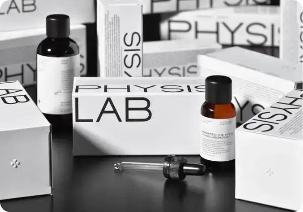
The color combination has a strong force in communication and often signals different aspects of beauty in minimalist cosmetic packaging. These colors reflect softness and purity.
Here are different colors and how they signal beauty for your cosmetic products.
Blues & teals: competence, cleanliness, hydration; common in skincare/dermatologist-led lines.
Greens: “natural,” calm, sometimes clinical, especially in sensitive-skin SKUs. Pair with matte finishes to feel honest, not flashy.
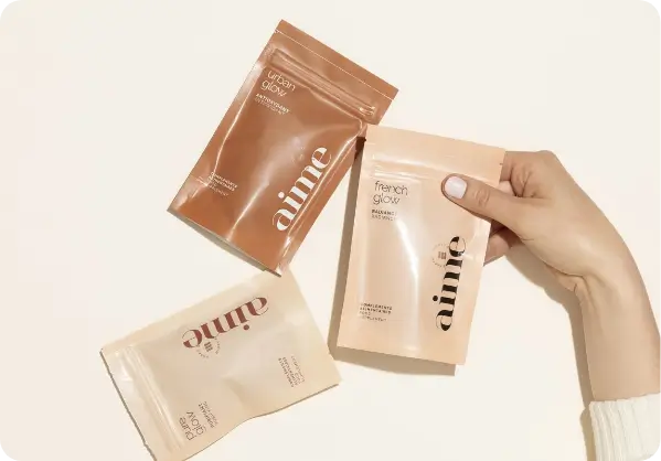
Pinks/Corals: energy, playfulness, approachability, seen in color cosmetics and K-beauty; can draw fast attention.
Black, charcoal, deep neutrals: luxe, serious, high-tech. Lower saturation can read more premium. Metallic gold accents push “prestige.”
Whites/very light neutrals: purity, gentle, fragrance-free cues; great for sensitive lines when contrast is handled correctly.
Remember: meaning shifts by context (lipstick vs. sunscreen) and market (US vs. China). Test with your audience.
Shelf Impact: Color is your “find me” button
Shoppers scan fast under time pressure. In that blur, contrast and distinctive hue help your pack “pop” from the set. Lab and in-store eye-tracking finds that physical design features, especially contrast, dominate early search.
For makeup walls, where SKUs crowd together, tiny hue/value tweaks can be the difference between getting noticed or blending in. Simulate your shelf and measure dwell time before you print.
Shelf studies back the same idea: arrange colors so your SKU blocks create a strong outline, then use a secondary accent color to guide the eye to claims (SPF, shade family). This balances “pop” with readability.
E-commerce thumbnails: The new first impression for your cosmetics
In e-commerce, a cosmetic’s thumbnail acts as the first visual introduction of your product. High-quality, attractive, and clear content play a key role in capturing attention.
On mobile, a 1-inch thumbnail does most of the work. Palettes with clean backgrounds, solid contrast, and one strong accent tend to win clicks.
Also, mind legibility: your shade name or claim must pass basic contrast thresholds. WCAG guidelines recommend a contrast ratio of 4.5:1 for normal text, and 3:1 for large text. That matters on cartons and in product images.
Pro move: Make a “small-size” proof for every hero image and front panel, and run a quick contrast check before sign-off.
Shade confidence: Using color to reduce returns
Foundation and concealer are returned when shade match fails. Cosmetic packaging color can help by:
Grouping by undertone (cool/neutral/warm) with subtle banding.
Using clear windows so real product color shows.
Keeping naming systems consistent and easy to read (contrast, hierarchy).
It is important to use color to guide, not mislead. If the cap or label hue overpromises (e.g., it is rosier than the actual product), trust is eroded. It is a general best practice based on the literature on color perception.
Men’s grooming vs. gender-neutral beauty color choices
“Men’s” used to mean black/gray/blue with heavy type. That’s changing. Performance-led brands now lean on cleaner neutrals, greens, and teals to cue efficacy and sustainability. At the same time, gender-neutral lines pick balanced palettes (taupe, off-white, charcoal) plus a single accent. The aim is to make it modern, accessible, and not gender-specific. Do not follow stereotypes, but check what works with your buyer.
Two pitfalls to avoid with color
Poor contrast: Pale pastels combined with low-contrast type = unread claims and lost sales (and complaints). WCAG gives clear minimums; use them.
“Green” without proof: Green tints and kraft textures won’t save you from scrutiny. There is a push for evidence behind eco-claims in the U.S. and EU, with the Green Claims Directive and the new consumer rules (2024/825) both currently in development. You should keep receipts.
Testing color choices like a pro
Mock the set: Print to scale and place your SKUs in the real planogram next to rivals. Photograph at eye level; review on a phone.
Run quick eye-tracking or attention tests: Even small panels help you see which colors attract fixations and which claims are missed. Cosmetic-specific evidence shows color can change pupil response (attention).
AB thumbnails: Create two hero images (background color + accent color) and compare click-through in ads before investing in a global asset.

Final Thoughts
Among the factors that influence cosmetic purchase decisions are the packaging colors. It controls two critical factors: attention and expectations. It helps consumers find what works for them quickly by setting the vibe (calm, bold, clean, luxe) through hue, saturation, and value.
The best results come when color meaning matches product promise, contrast makes claims easy to read, and you validate choices with quick testing (shelf and thumbnail). Keep culture in mind, keep claims honest, and let sustainability show in both materials and message.
Do that, and your color system stops being decoration; it becomes a reliable driver of trial, trust, and repeat. You can get effective cosmetic packaging from Print247 at an affordable price.
FAQs
What’s the “best” color for skincare packaging?
There isn’t one. Pick hue by promise: blues/teals often cue hydration and efficacy; soft neutrals can feel gentle; greens can signal “natural.” Then ensure a strong contrast for claims and test on a mocked shelf and thumbnail before launch.
Do bold colors always sell better?
Bold colors grab attention, but fit matters. In premium lines, slightly less saturated palettes can feel more luxe. Match saturation to price tier and category, and verify with A/B tests and eye-tracking if possible.
How do I make packaging color work online?
Design hero images for tiny sizes. Keep backgrounds clean, use one accent hue, and hit WCAG contrast ratios so shade names and claims read on phones. Test two thumbnail treatments before rollout.
Are color meanings the same around the world?
No. Some trends hold (blue is widely liked), but many meanings shift by culture. Validate palettes and color names in-market before scaling global designs.
Can “green” packaging color get me in trouble?
Color isn’t the issue, claims are. In the U.S., follow t he FTC Green Guides, and in the EU keep an eye on consumer rules and the changing status of the Green Claims Directive. Back every eco claim with clear evidence.
How many colors should a brand use across SKUs?
The system should be simple: one core brand color, a secondary accent, and controlled neutrals. Then use subtle bands or caps to signal shade families or benefits. Too many loud colors fight each other and hinder findability.
